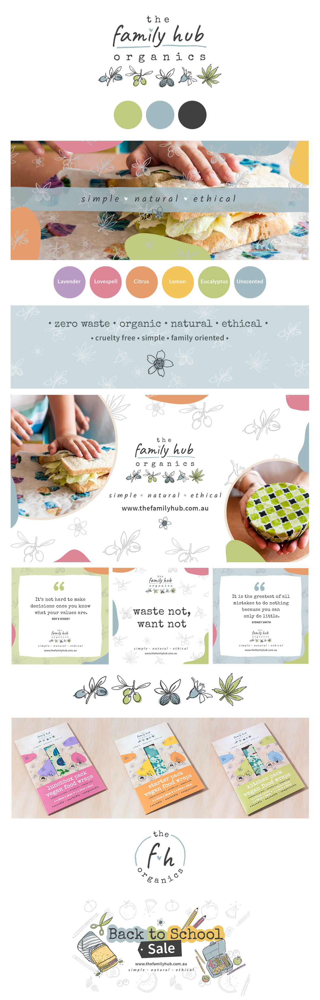
THE FAMILY HUB ORGANICS
Branding Refresh
The Family Hub Organics has products that are made with zero waste – designed to lighten the chemical load on people and our environment. The products have all been created, recipes written, tested and handmade by this fantastic family business.
• Approach
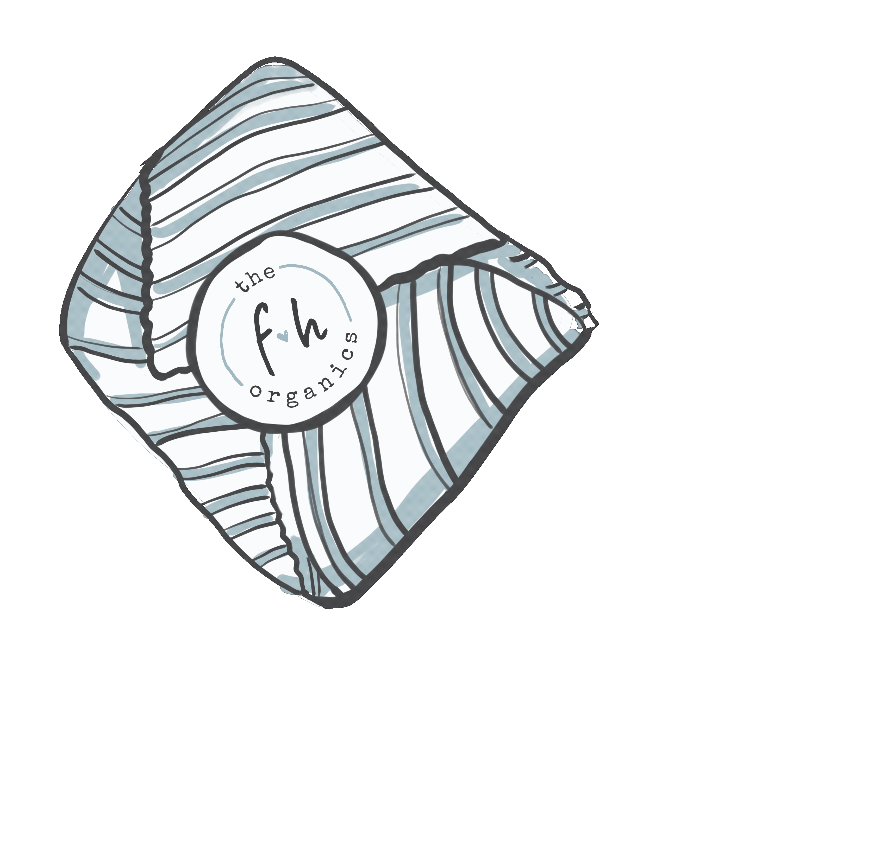
The main logo design is made up of hand drawn images of the most used ingredients within the products including: jojoba, olive, shea, candelilla and hemp. And these are also used as a pattern element across the branding.
The tagline encompasses all that this business stands for – Simple. Natural. Ethical. There’s a heart in the middle of the sub logo and also on the “i” in family because love is at the centre of all that they do. The colours of the main logo consists of natural blues and greens and the darker charcoal. The brighter shapes of colour are used to represent the different products and scents.
Packaging was also designed for the 3 different styles of vegan wraps: The Starter Pack, Lunchbox Wrap and the Kitchen Wrap.
Animated .gifs were also created for some promotional work and Back to School specials.